
VYRO Branding
Overview
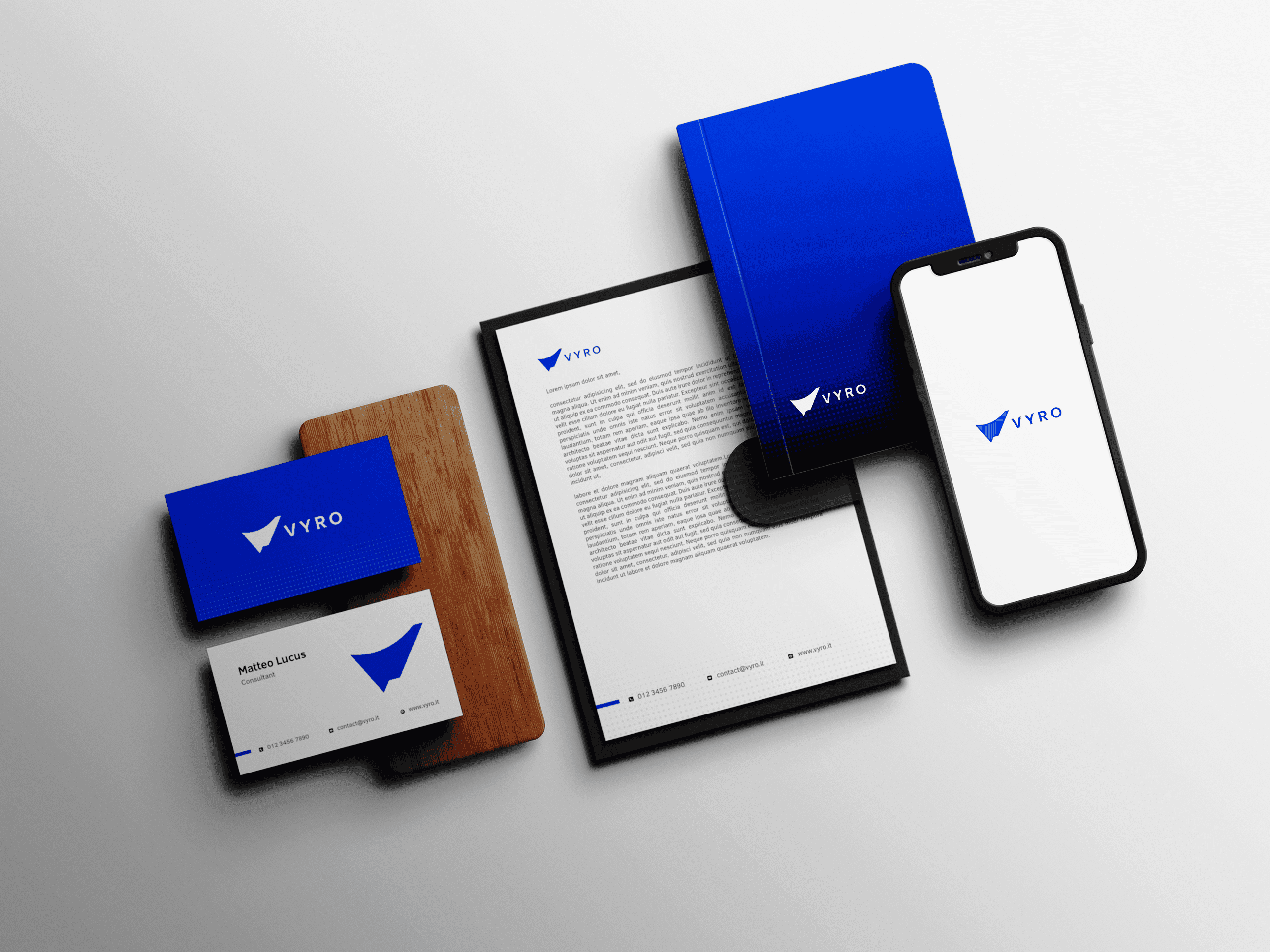
Conceptual logo identity for VYRO, a minimal modern typography with a unique bold visual direction that is instantly identifiable
We wanted a confident, modern identity for the VYRO logo to reflect professionalism through simplicity without sacrificing memorability. The concept is nice typography, golden ratio proportions and a gorgeous visual style that lets the logo operate equally well digitally as on physical media.
Instead of gimmicky graphics, the identity leans on a bold yet adaptable design system that helps keeps VYRO recognizable whether viewed across websites, social media, marketing materials, packaging, wayfinding and branded merchandise. The logo was optimised for different sizes but special care went into how the lettering sits both in relation to air and balance making sure it is extremely legible at all sizes.
The last identity gives VYRO a flexible foundation, which will grow with the brand while using a clear visual voice.